A style note from Kerrie Kelly, Fabuwood Creative Director
"For years, we've been designing homes around what felt safe. Soft whites, warm greiges, and neutral palettes created beautiful backdrops, but somewhere along the way many spaces stopped telling the stories of the people who lived in them. Today, I'm seeing something different."
Homeowners are craving spaces that feel more personal, more collected, and more reflective of who they are. They're looking for rooms that spark conversation when friends gather around the island, create a sense of calm at the end of a busy day, and feel layered with meaning rather than simply styled for a photograph.
We're moving beyond the idea that every home should fit a singular aesthetic. Instead, we're embracing color, texture, and individuality in ways that feel sophisticated, timeless, and deeply personal. Not because we're chasing trends, but because we're designing homes that feel authentic to the people who live in them.
"For me, great design has always been about creating spaces that support the way we live. The kitchen where family recipes are passed down. The island where homework, happy hours, and holiday baking all happen in the same week. The home that feels unmistakably yours the moment you walk through the door."
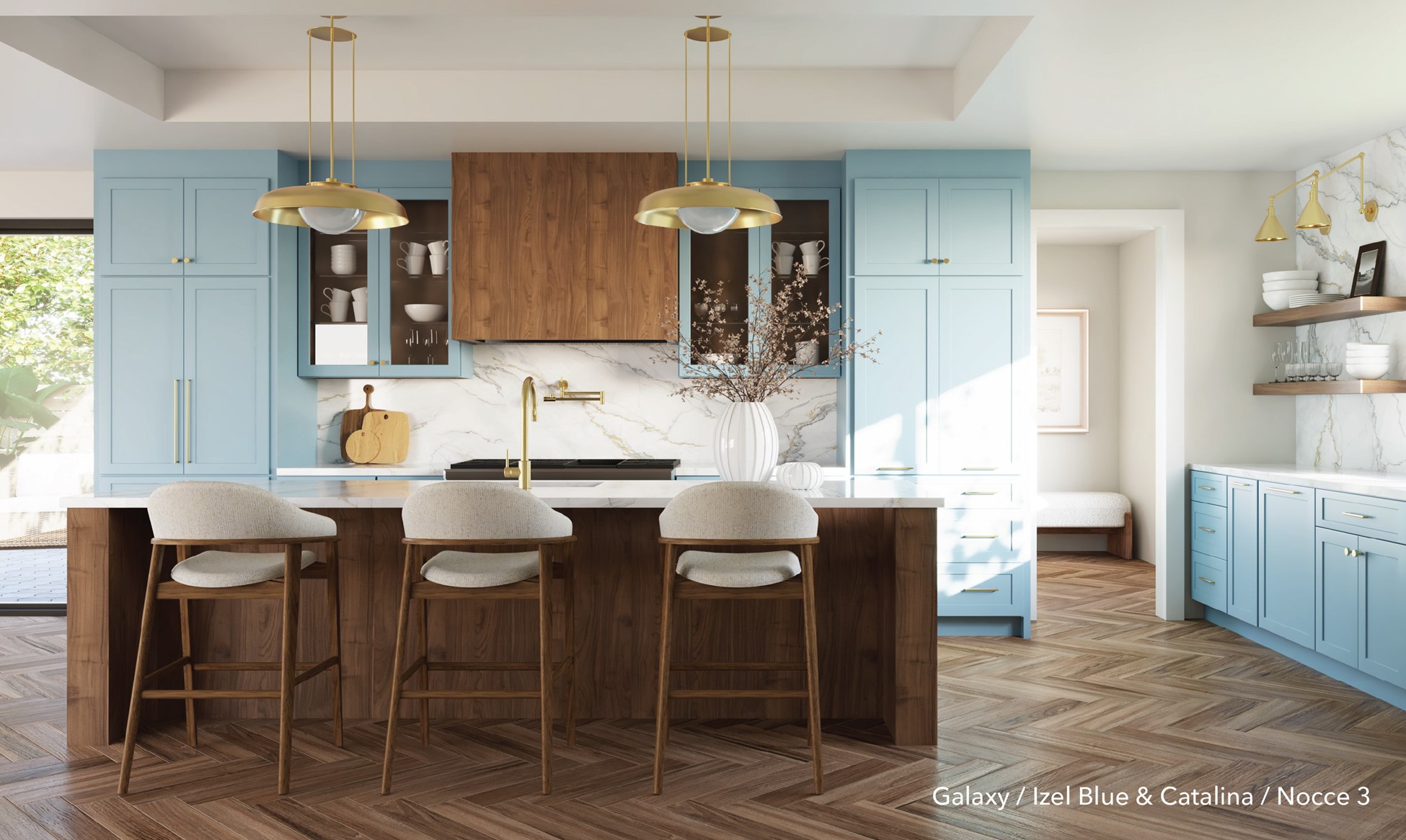
And that's exactly why burgundy and blue are having such a moment.
These colors bring personality without sacrificing elegance. They create depth, warmth, and character while still feeling approachable and livable. Paired with natural materials, thoughtful layering, and beautiful craftsmanship, they allow us to create spaces that feel curated rather than decorated.
In other words, they're helping us move away from homes that simply look beautiful and toward homes that feel personal.”
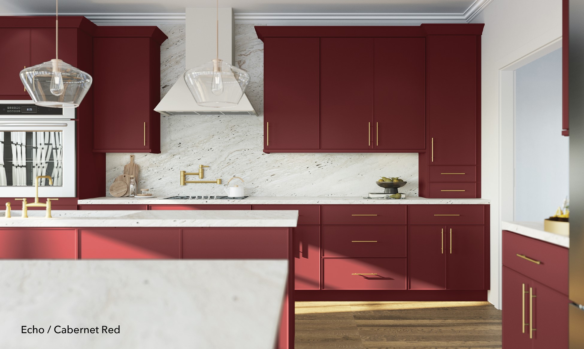
Burgundy: the color that finally feels personal
The trend forecasters at Wallpaper* call burgundy one of the "stirringly dark hues" defining the year, dramatic, romantic, and elegant all at once. LUXE Interiors + Design describes 2026 palettes openly "moving away from safe, all-neutral" schemes toward merlot, oxblood, and plum layered with warm metals and dark wood. The point everyone agrees on is the one Kerrie keeps coming back to: this is color you feel.
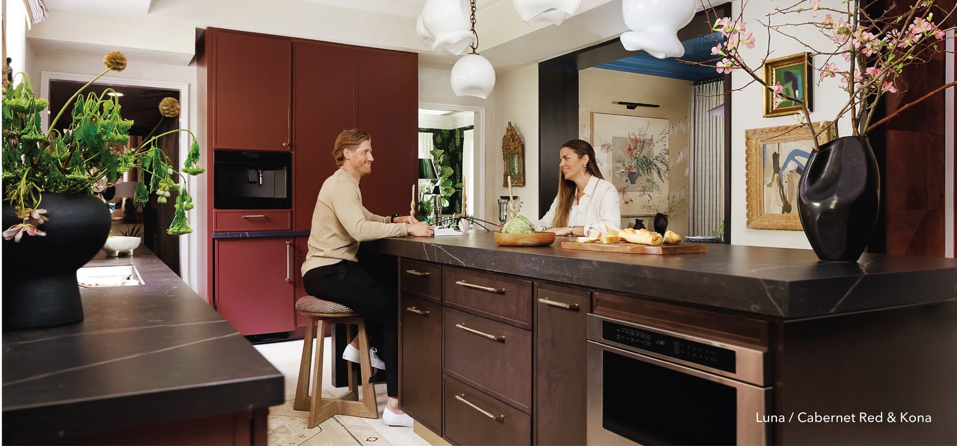
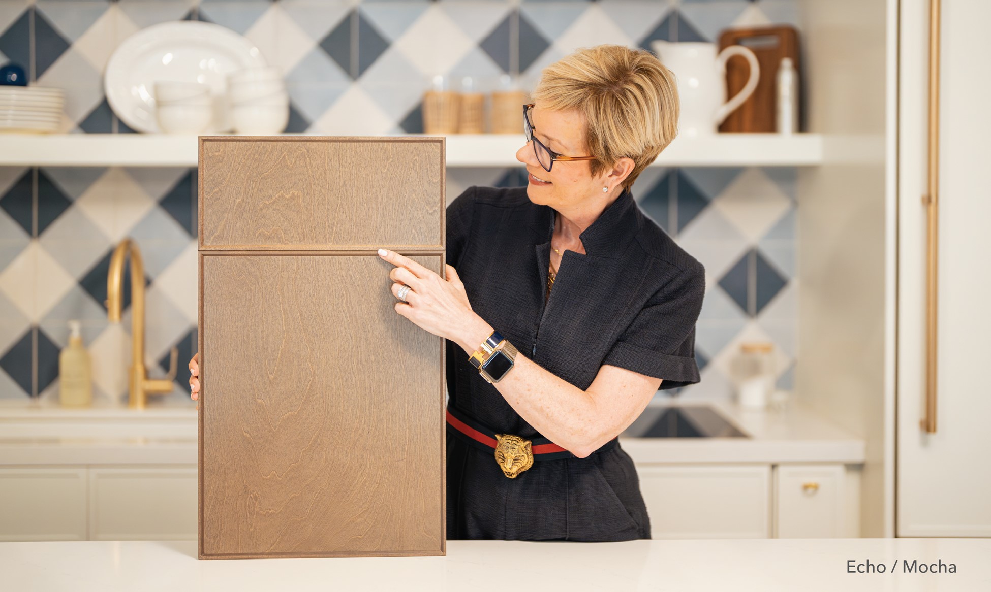
A rich red doesn't shout. It immerses. It wraps a room in something intimate and a little glamorous; the way a glass of something good warms a dinner party. Our Echo door style in Cabernet Red was made for exactly this mood, and it's become a favorite for anyone considering red kitchen cabinets. Echo is our refined thin shaker, a delicate micro-frame with a crisp 45° beveled inner edge that reads as quietly architectural rather than fussy. In Cabernet, that clean profile keeps a bold color feeling elevated instead of heavy. It warms up a spare, minimalist kitchen and amplifies a layered, collected one.
Blue, growing up gracefully
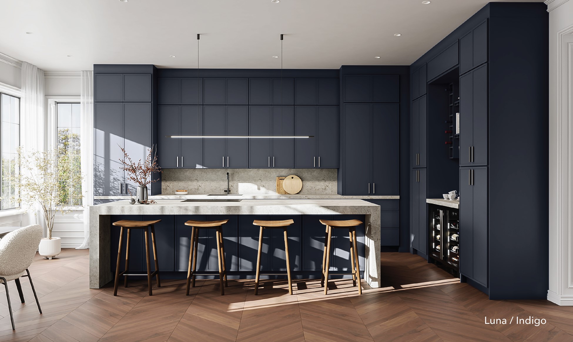
If burgundy is the year's drama, blue is its composure. And blue has been evolving — softer now, more atmospheric, less primary-colored statement and more European calm. It's the most versatile color we work with: contemporary one minute, transitional the next, equally at home in a coastal kitchen or a moody city loft. It's little wonder that navy blue kitchen cabinets keep topping the list when people ask us about 2026 kitchen color trends.
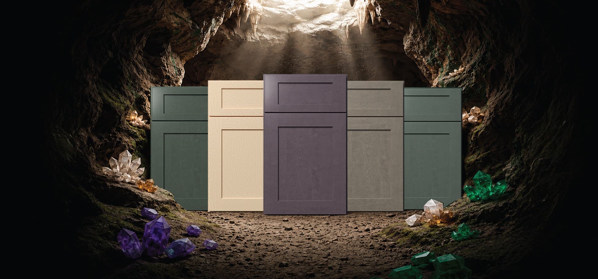
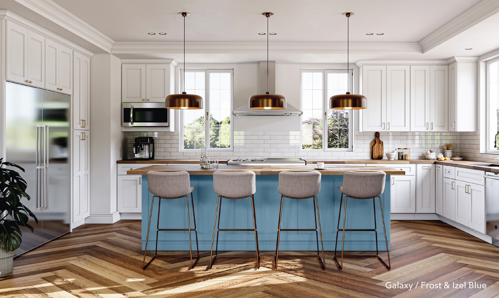
Our Luna slim shaker in Izel Blue and Indigo captures that shift exactly. Luna trims the traditional shaker frame down to a sleek, slim profile with a wider center panel — modern, serene, transitional by nature. In a soft, atmospheric blue, it brings personality and depth to a space without ever tipping into noise.
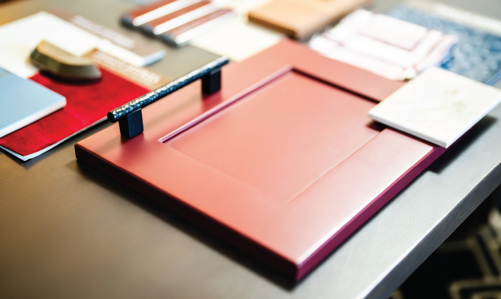
About that old rule (the one your grandmother believed)
For most of the last century — a hangover from early-1900s menswear etiquette — you were not supposed to wear navy and black together. The thinking, per the fashion historians, was that pairing two dark tones you couldn't easily tell apart looked "gauche," as if you'd gotten dressed in the dark and couldn't see the difference. It got filed alongside "no white after Labor Day" in the great book of arbitrary style commandments.
Then designers and editors did what they always do, and broke it on purpose. Today navy and black are treated as a single, elevated neutral family — proof that the most sophisticated move is often the one the rules warned you against. The same is gloriously true in a kitchen.
Look at our Huntington project: crisp white perimeter cabinetry, a rich blue island, warm wood accents, and matte black hardware the exact navy-and-black "faux pas," layered with intention, reading as classic, custom, and quietly expensive. Or go fully immersive with Idaho Mountain Living, where deep Luna Indigo meets warm Kona wood tones for a dark, moody, mountain-modern kitchen that feels like a held breath. Indigo, near-black depth, and real wood grain, doing in a kitchen what a great navy-and-black outfit does on a person.
The part everyone forgets: the wood
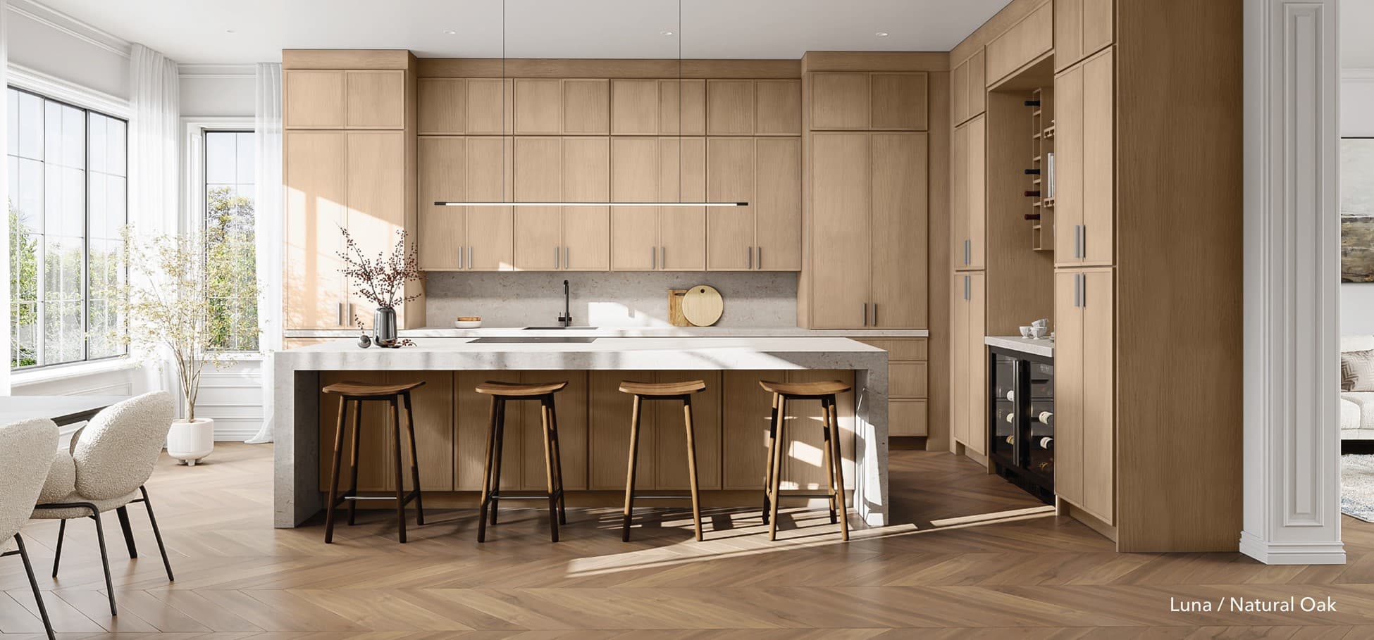
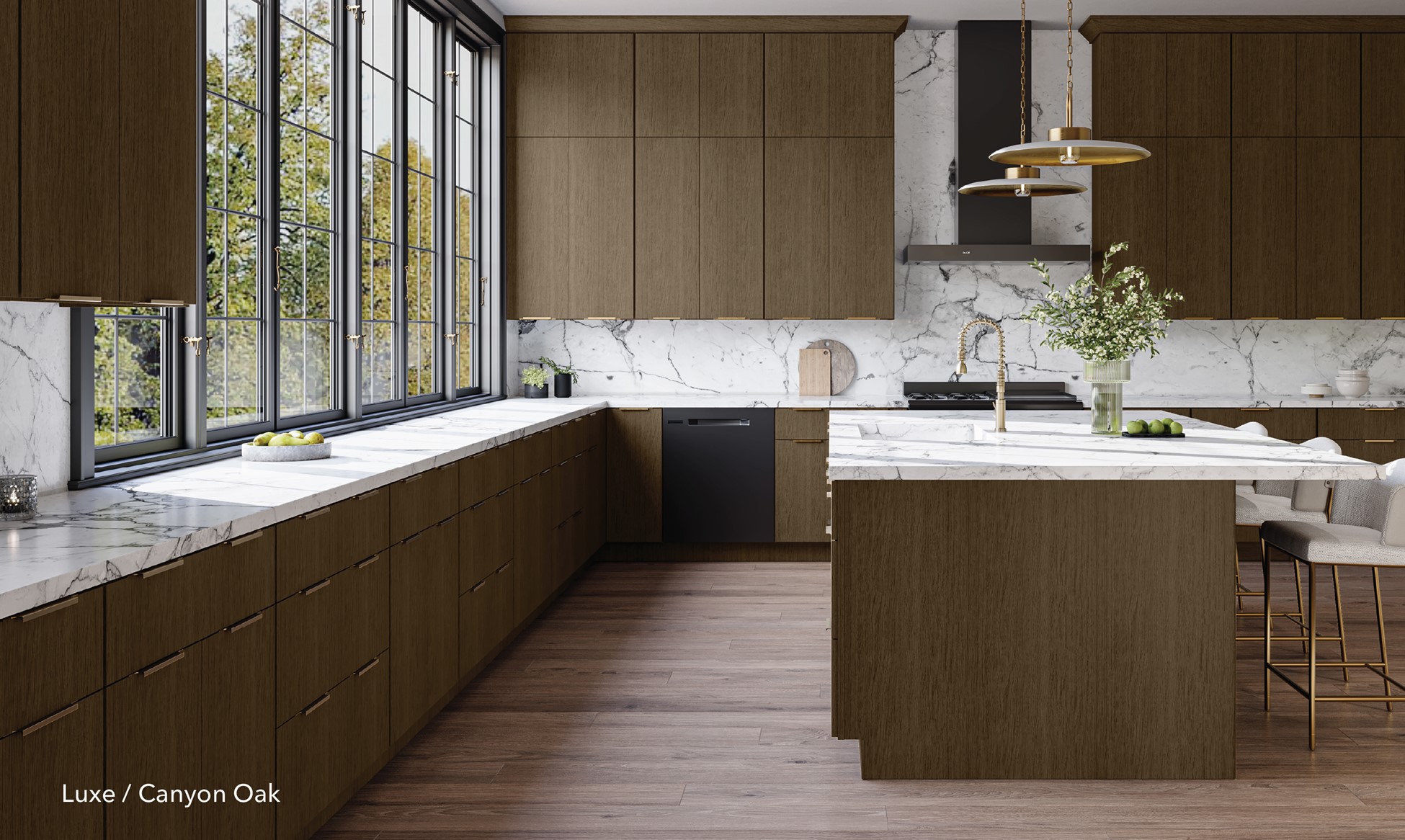
Color this rich needs something to stand on, and that's where natural materials earn their keep Our Luxe slab in Canyon Oak — a rift-cut white oak veneer in a deep, dramatic finish — is the grounding note in the whole composition. Smooth, richly grained, and quietly architectural, it's the thing that keeps burgundy from feeling theatrical and blue from feeling cold. Pair a wine red or an atmospheric indigo with that natural oak grain and clean, streamlined forms, and the palette suddenly reads as intentional rather than trendy. The designers surveyed by Apartment Therapy landed on the same formula for 2026: muted, lighter tones paired with rich, darker ones, depth you can live inside.
A home should entertain the eye the way a great tablescape welcomes guests.
Think about the most beautiful table you've ever sat at. It was never one color. It was the wine glowing in the glass, the blue hour going violet in the windows, brass candlesticks catching the light, a run of linen, and underneath it all the warm wood of the table itself. Nobody chose those things to "match." They chose them to layer, depth, contrast, a little glamour, something to ground it.
That's all a well-designed home is: a tablescape you get to live inside. The wine, the dusk-blue, the brass, the wood. Thoughtful contrast instead of safe sameness.
You don't have to commit to everything
You shouldn’t repaint your whole life Cabernet by Friday. If you learn transitional, or modern, or you've never met a beige you didn't trust, start small and let the color earn your confidence. An island in Izel Blue. A pantry in Cabernet A range hood wall in indigo against warm Canyon Oak. One brave move, layered with calm neutrals and real materials, is all it takes to tip a room from sepia into Technicolor.
Because the goal was never a kitchen that looks like everyone else's nicest kitchen. The goal is the deep, uncomplicated satisfaction of a space that is unmistakably, fingerprint-for-fingerprint, yours.
There's no place like it.
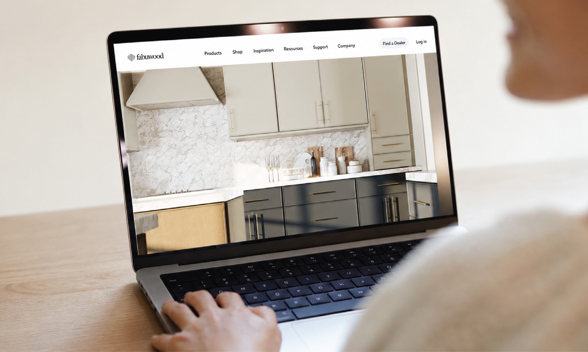
Ready to step out of the beige? Explore the looks above, order samples to live with the color in your own light, or play with combinations in the Fabuwood gallery.